[haiku] Re: Suggestions to change double click on window title behaviour
- From: Ryan Leavengood <leavengood@xxxxxxxxx>
- To: haiku@xxxxxxxxxxxxx
- Date: Mon, 2 Nov 2009 15:51:30 -0500
On Sun, Nov 1, 2009 at 7:09 PM, Nicholas Blachford
<nicholas@xxxxxxxxxxxxxx> wrote:
>
> A connected issue to this is the aesthetics (i.e. beauty) of the system:
> A colleague of mine downloaded Haiku and tried it out. He played around
> with it a bit but one of the reasons he didn't like it was the fact it
> looked "very 90s". BTW he's about as technical a person as you're likely to
> find anywhere.
I have heard this comment before, but what I would like to know is
what exactly is so 90s about the Haiku GUI? Also what makes Mac OS X
Snow Leopard or Windows 7 so "2000s" in their GUIs? Excessive and
gratuitous use of alpha blending? I find the Vista/7 "blurry
transparent" window borders ("Aero Glass") about as stupid and
gratuitous as you can get, though the Mac OS X menu bar and Dock are
a close second. Maybe it is the "shiny" buttons? How long will it take
before those are considered as ugly and dated as the original Mac OS X
interface? Remember the pinstripes? Ugh!!!
Ubuntu doesn't use much of that crap (to their credit) and because of
that I don't see how Ubuntu looks any more "modern" than Haiku.
On the other hand I do like some curves here and there, and would like
at least the option of some window transparency (without getting
stupid about it.) Shadows are also nice.
But the point is, a GUI's looks are extremely subjective, and most
recent efforts to "modernize" GUIs have been kind of stupid and have
resulted in some really bad user interfaces. If Haiku should copy
anything it should copy some of the modern smart phone GUIs, which
look nice without getting stupid and inefficient about it (because
they have to be efficient on a phone.)
> However, unfortunately I have to agree, I find the look ugly and worse:
> antiquated. Haiku may be nice and new underneath but the look is like a
> trip back to 1998 for me. I've always figured it'll eventually be brought
> up to date at some point. I guess it's probably an R2 thing though.
Well the Haiku GUI has been updated in several ways, both beyond what
it was earlier in the project and of course compared to BeOS. I still
think a few things could be updated (I don't like the scrollbars much)
but I don't think it is as dated as some people think.
> It very fashionable in technical circles to try and ignore aesthetics and
> concentrate purely on functionality, however to do this is to ignore the
> face we are all human beings and as such we are visually orientated
> creatures. Aesthetics matter.
Aesthetics do matter, and I think it is very unfair to people like
Stephan and myself who have done various work on Haiku's aesthetics
(him much more than me) to assume no thought has been put into Haiku's
aesthetics. As one example I think our icons are quite beautiful
without getting into the huge, inefficient and somewhat ridiculous
pseudo-photorealistic icons used on some other systems. Our fonts look
nice and are rendered in a way unique to Haiku, blending the best of
both worlds in having sharp straight lines but anti-aliased curves.
Gradients are used in several places without getting gratuitous.
> Sorry about the length of this, but it hit a nerve. I liked BeOS because it
> was advanced, I'm horrified at the thought that Haiku could ignore all the
> advances in GUIs in the last decade and become yet another retro OS.
Please enumerate the advances in GUIs in the last decade that you
think Haiku lacks. I'll give you my list:
- Non-rectangular windows. Used correctly I think these can be nice.
They can also be abused (see past versions of Windows Media Player.)
Having some curved corners here and there (maybe on windows, the
Deskbar and the Twitcher) would be nice and would fit in well with
some of "organic" themes represented by Haiku's leaf logo.
- The option for transparency. I think the Apple Cmd-Tab window is a
nice use of transparency, as well as the overlays for volume changes,
contrast changes and Spaces changes. On the other hand the transparent
menu bar and Dock are dumb and hurt usability.
- Shadows. These help the top level window stand out and make it
easier to find the mouse cursor. We at least have a subtle shadow on
the Haiku mouse cursor, but not on windows yet.
- Tasteful animations. The lack of at least a window hiding animation
is indeed a problem.
Of course using the power of the video card to do all the above
efficiently goes without saying.
Most other stuff is just trivial eye candy (such as "shiny" buttons or
whatever.) And don't get me started on some of the crap that comes
with Linux's Compiz and Beryl (a workspace cube, "burning" windows,
wobbly windows and other stupid adolescent crap.) Though I will admit
the latest Ubuntu and Linux Mint (based on Ubuntu) have used Compiz
fairly tastefully.
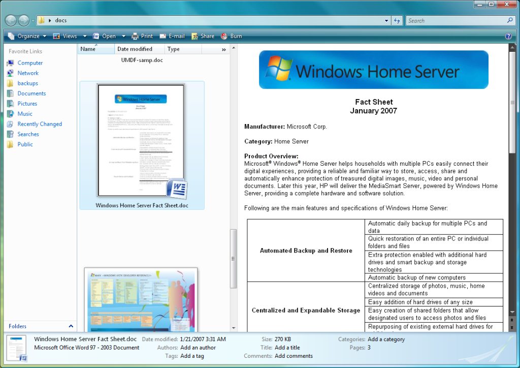
And the more I look at it the more I think Windows 7 and Vista are
just freaking ugly and hard on the eyes. I mean look at this crap
(posted earlier in this thread):
http://www.activewin.com/winvista/images/Windows%20Explorer%20-%20Preview%20Pane.png
And other people have complained about the various gross
inconsistencies in Vista (which I'm sure 7 continues to some extent.)
--
Regards,
Ryan
Other related posts: