[haiku] Re: Request: Graphic for R1A2 CD
- From: "Jorge G. Mare" <koki@xxxxxxxxxxxxx>
- To: haiku@xxxxxxxxxxxxx
- Date: Mon, 19 Apr 2010 12:28:47 -0700
Howdy,

Justin Stressman wrote:
    Just a really quick hack on Jorge's design to get a look at the
    ideas...


http://i32.photobucket.com/albums/d12/phreadom/haiku/2010-04-haiku-r1a2-cd3.png

    Something like this?


http://i32.photobucket.com/albums/d12/phreadom/haiku/2010-04-haiku-r1a2-cd4.png

Or like that... (brighter to make the difference more clear)
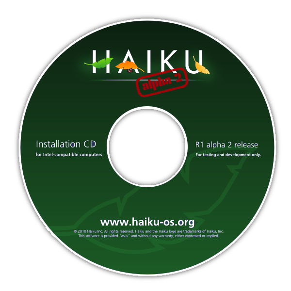
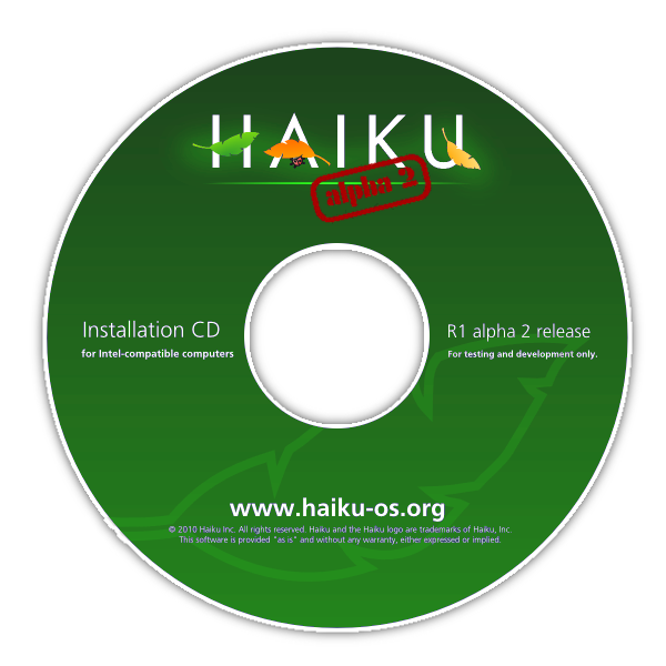
The green background does not look bad, particularly the darker green
which provides a better contrast for the logo and the white text. :)
That being said, uniformity of color throughout all artwork (website,
flier, sticker, CDs, etc.) is important (essential) from the POV of
reinforcing the brand and increasing brand equity, so personally I would
prefer not go down the road of changing background colors, particularly
given that both the [ALPHA 2] stamp and the "R1 alpha 2 release" text
are prominent enough to make the different versions easily distinguishable.
Cheers,

--
Jorge/aka Koki
Website: http://haikuzone.net
RSS: http://haikuzone.net/rss.xml
Other related posts:
