[haiku-development] Re: RFC: B_INVALID flag for BControlLook
- From: John Scipione <jscipione@xxxxxxxxx>
- To: "haiku-development@xxxxxxxxxxxxx" <haiku-development@xxxxxxxxxxxxx>
- Date: Wed, 1 Oct 2014 14:22:05 -0400
On Wed, Oct 1, 2014 at 11:36 AM, Axel Dörfler <axeld@xxxxxxxxxxxxxxxx> wrote:
> Am 01/10/2014 17:29, schrieb John Scipione:
>>
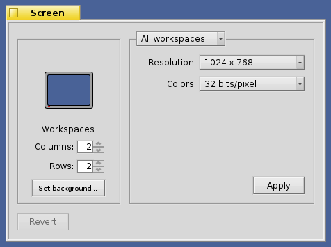
>> This screenshot is a bit old but gives you the idea:
>>
>>
>> http://33.media.tumblr.com/7612ba5d79042ea529d24d3a041670c9/tumblr_n2eggbZRnQ1r0f0hfo1_500.png
>
>
> It's dead ugly in any case :-)
It looks a bit better than that now, but, still uses a grey rectangles
on lighter grey background, more work could be done on the appearance
I just haven't had the time.
> But apart from that, I don't think it's that usable either since the click
> targets are very small.
> Why not use standard sized buttons like this:
>
> +-----------------+---+---+
> | 42 | < | > |
> +-----------------+---+---+
>
> That would look much nicer, and should be equally clear.
I've never seen a spinbox implemented that way, up/down is more clear
than right/left even though the click targets are smaller. You can
also push the arrow keys to increment and decrement the value. I
suppose you could have the text box then full height up arrow then
full height down arrow from left to right to make the click targets
bigger.
Other related posts: