[openbeos-cdt] Re: Some experiments
- From: Eddy Groen <eddyspeeder@xxxxxxxxx>
- To: openbeos-cdt@xxxxxxxxxxxxx
- Date: Tue, 10 Nov 2009 18:57:21 +0100
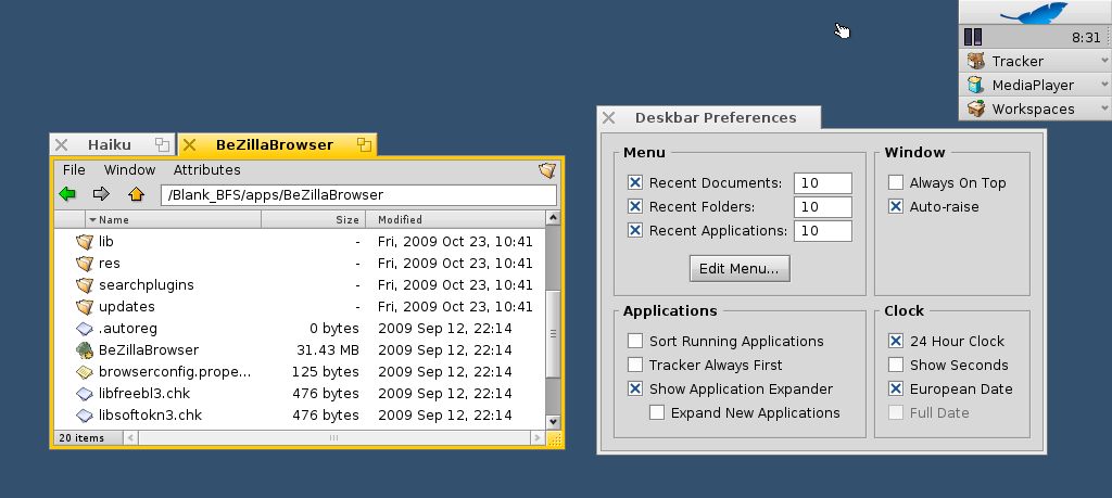
I'd like to emphasize one thing I *really really* like in one of Johan's
designs, which is the removal of lines in mockup two (in case you can't see
what has been done, flip back and forth between his first and second
mockup). This does MIRACLES for the interface. Indeed, it needs some further
consideration to make sure the menu buttons will still be identified as
such. Additionally, the address field needs to stand out a little more. I'd
propose a heavier border (keeping the current gray line and adding a black
line within).
The philosophy that Johan puts forth with that second mockup is something I
completely agree with.
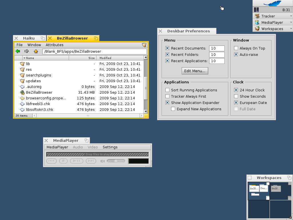
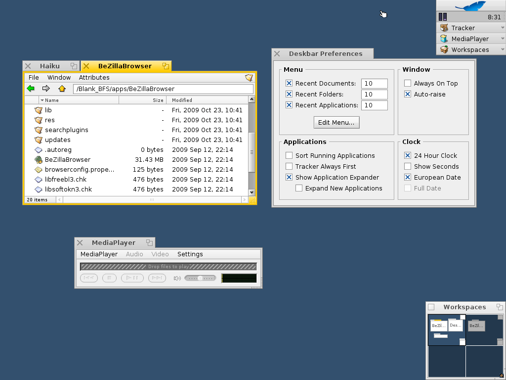
Now as for screenshots 1 and 3:
The reversed contrast is okay as far as the interface gray goes, but the
surrounding decor gets too dark and too heavy. Just looking at the Deskbar
Preferences window, it completely drags one's focus out of there. I would be
okay with making the panel color lighter (as in the reverse contrast
mockup), but the border/decor color for an inactive window should then stay
the same color, save perhaps for a little offset gradient to distinguish the
panel from the rest.
The X is just a bit too large for my taste (Johan pointed that out as well),
but it's going the right direction. In an earlier email today, I made
mention of window decors that used X'es in stead of squares. Here are two:
http://www.zeta-os.com/cms/images/newspost_images/abiword.jpg (SmokeDecor)
http://revolf.free.fr/beos/shots/shot_xemacs_zeta_pretty_gonx.png
About the yellow border: completely unaware of your sketch I've made mention
of the "Menlo" window decor. yellowTAB has tried and ditched it. The yellow
border is UI cluttering. Don't do it, period.
Higher contrast in scroll bars is not necessary in my opinion. The yellowTAB
decor uses lighter backgrounds with gradients (though I just referred to it
in another email, in case you missed it, here it is again:
http://mobile.osnews.com/img/17518/apps.png ).
2009/11/10 Johan Aires Rastén <johan@xxxxxxxx>
> I did some photoshopping to try out a few ideas. Not saying they're
> better than current Haiku or that anything should be changed yet :)
>
> 1) http://www.oljud.se/files/haiku/1_border_handles_contrast.png
>
> Painted active window border yellow to make it stand out from the
> background. Also made it flat coloured because it was too distracting
> when embossed.
> Increased contrast on buttons and slider background to make objects
> you can interact with stand out more.
> Added handle on sliders because they're movable.
> Tried to do something similar with the resize-corner of the
> mediaplayer but it looks like crap :P
> Put X as close buttons (arguments in other discussion). I know it
> looks a little too heavy so it would definitely require tweaking.
>
>
> 2) http://www.oljud.se/files/haiku/2_flat_background.png
>
> Made the background of the menu and toolbar flat because it felt a
> little cluttered with all those lines. IMO backgrounds should be
> pretty flat while objects should stand out more using gloss, shadows
> and/or emboss. There's a potential risk that the menu items are
> mistaken for labels so this isn't a very good solution, just wanted to
> see what it would look like. Tried a yellow background, something
> similar to what Mint does, but it just looked weird.
>
>
> 3) http://www.oljud.se/files/haiku/3_reverse_contrast.png
>
> Reversed the contrasts of window border and contents. The reasons for
> this is that I wanted to reduce focus on the border and increase focus
> on window contents. I also wanted a little more difference in
> luminosity between active and inactive tabs.
>
>
> -) And what I didn't do: Rounded corners on anything, because it's too
> fiddly :)
>
>
Other related posts: