[yoshimi] Re: Splash screen candidates
- From: Jesper Lloyd <jpl.lloyd@xxxxxxxxx>
- To: yoshimi@xxxxxxxxxxxxx
- Date: Wed, 1 Feb 2017 20:29:35 +0100
Thank you for your kind words!
2017-02-01 0:16 GMT+01:00 Frank Neumann:
The only thing I am not quite so happy with is to include features in the
splash image - in my opinion the "Realtime . Microtuning . MIDI Learn"
doesn't belong here, it sounds..uhm..like sales pitch :-). I can image some
kind of slogan (wasn't there this "The Friendly Softsynth" term?) would fit
better than a feature list.
I agree that it is an eyeful, and as I originally used the contents of the
old splash screen as a template (title, subtitle, assorted features, robot,
notes) this semi-arbitrary assortment of features simply stuck around. The
slogan was just made up to fill space when I threw together the temporary
test-version in the yoshimi repo, but we can probably do with something
more inspired than "Polyphonic soft-synth".
2017-02-01 9:52 GMT+01:00 Lorenzo Sutton:
Ideally I would eliminate the musical notation, while leaving of course
the sound wave. Conceptually I like the idea of Yoshimi not necessarily
being linked to music notation etc. also in terms of software
functionality, its being able to do microtonal etc.
But maybe I'm being a bit too conceptual.
I have thought along the same lines, from a symbolic perspective it doesn't
necessarily reflect the functionality of the software. From an aesthetic
standpoint however, it provides some contrast and emphasis for the
horizontal dividing line, which I personally think makes for a better image.
Since there is no urgent deadline on this, I will try out alternative
arrangements with some MIDI illustrations (bars & control curves) during
the weekend.
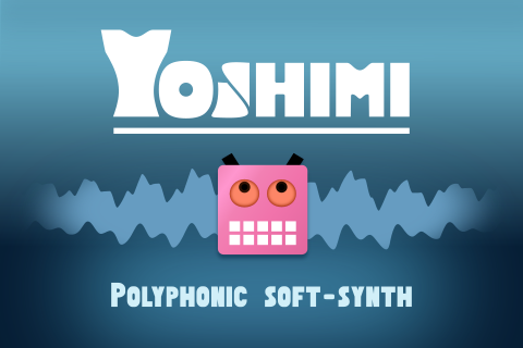
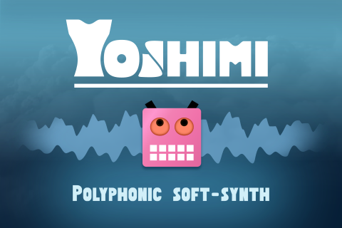
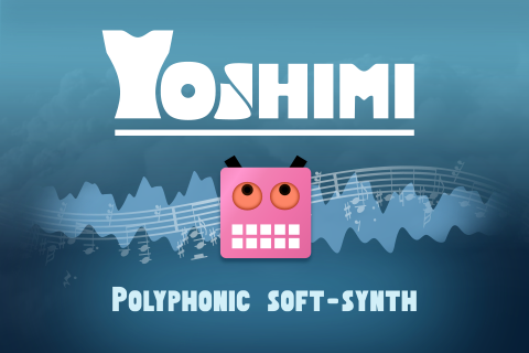
Here is an updated selection, based on your feedback.
Without notes, the second should be C-2:
https://raw.githubusercontent.com/jplloyd/YoshimiSplashConcepts/24ef24c53ddbb5411b00db87032a2ef4c100136c/renders/candidates/Splash3C-1.png
https://raw.githubusercontent.com/jplloyd/YoshimiSplashConcepts/a5da214b7af508b02ee8440e8218aac413e19749/renders/candidates/Splash3C-1.png
With notes:
https://raw.githubusercontent.com/jplloyd/YoshimiSplashConcepts/2446a25ff3e1b3e8b73ab06fe8816855e0baf3f6/renders/candidates/Splash3C-1.png
https://raw.githubusercontent.com/jplloyd/YoshimiSplashConcepts/2446a25ff3e1b3e8b73ab06fe8816855e0baf3f6/renders/candidates/Splash3C-2.png
Feature list removed, components repositioned, musical notes toned down a
bit. I'm mothballing the metal and panel versions (sorry Frank) for the
time being.
Although I still like the clouds as they remind me a bit of the kind of
spectrogram you may see when experimenting with broad frequency bandwidths,
I think the plain versions works better in practice.
Other related posts:
