[openbeos] Re: GUI submission
- From: "Forgiel, Arnaud" <aforgiel@xxxxxxxx>
- To: "'openbeos@xxxxxxxxxxxxx '" <openbeos@xxxxxxxxxxxxx>
- Date: Mon, 4 Mar 2002 09:36:29 -0000
As the others said, it's nice work... However, here are some comments that I
hope will be constructive:
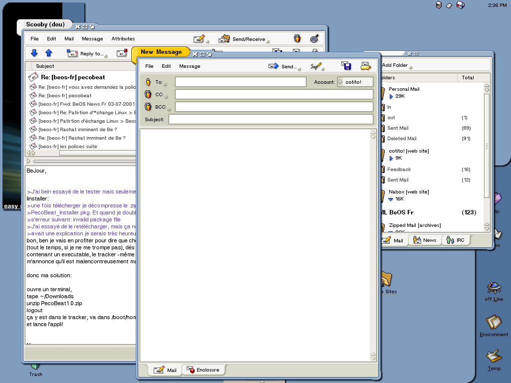
1. The size of the different widgets doesn't look consistent. As an example,
in the Network Preference window, the tab, text control and button have
different height.
2. The 3D effects are not consistent either: the shadow for the menu is
vertical while it is horizontal for the buttons
3. The font is different from the original BeOS one. It looks more Gnome
rather than R5. Could it be possible to use a free version of it?
4. Even if gray looks professional, the different shades of gray are
“blurring” the displayed information (in the mp3 player for example). Using
contrasted colors will help the apprehension of the interface by a new user.
We already spoke about Gonx as a future replacement of the general UI of
OpenBeOS. Could we just start to code it for R1? I have to admit this is the
best UI concept I’ve seen so far:
http://cotito.free.fr/projects/Gonx/0095.png
Regards,
Arnaud
-----Original Message-----
From: Andrew Gildehaus
To: openbeos@xxxxxxxxxxxxx
Sent: 3/3/02 7:42 AM
Subject: [openbeos] GUI Submission
Hello OBOS programmers et al:
I'm strolling over from the Creative team because I believe some of my
GUI
work is at a point where it needs some serious discussion by the people
who
actually might be putting some of my ideas to code. The idea was to
replace
the widgets and enhance the rest. My goal was not to create something
new,
but to update something we all know and love.
Please take a look at:
http://home.earthlink.net/~agildehaus/obos/concept-v1-wallpaper.jpg
(277KB)
http://home.earthlink.net/~agildehaus/obos/concept-v1-nowallpaper.jpg
(188KB)
And after you've looked, read below:
(FAQ)
Q: Looks good, but we can't use the icons!
A: You provide me with icons, I'll put them on this screenshot. The
copyright notice may be incorrect (should read Palm I suppose), but I
didn't
want to place their name on my work :)
Q: Where's the zoom button?!!?
A: It has gone to that big place for buttons in the sky, at least for
now.
I have found that many applications don't take into account the location
of
the Deskbar when they are zoomed (and with an Always on Top option, the
Deskbar covers a portion of the zoomed application as well). If you all
think the zoom button should be there I'll be happy to put it back, but
I've
rarely if ever used it.
Q: Drop shadows?
A: Yeah, call me a sucker for them. I realize translucent drop shadows
for
the windows probably won't be possible for R1.
Q: Why is "Network Prefs" depressed on the Deskbar? It's not the active
application.
A: Just showing what it would look like if one of those buttons was
clicked,
that is all.
Q: On the DriveSpace Deskbar plugin there are two circular buttons.
What do
they do?
A: They show the status of the drive. Red means the drive is the boot
drive, green means the drive is mounted, grey would mean the drive is
unmounted. Clicking the button will mount/unmount the drive.
Q: I don't like this new file view in the Tracker.
A: I think it's interesting. It wouldn't be the only view or the
default
view, of course.
Q: Resizing windows ... how?
A: Windows would be resizable by -all- of their borders.
Q: In what timezone is the time 50:38?
A: Err ...
Have fun pulling my work apart. Look at the widgets, the windows, the
Deskbar .. that's what the screenshot is all about. Deskbar Plugins and
the
like were just for fun.
Andrew
________________________________________________________________________
This email has been scanned for all viruses by the MessageLabs SkyScan
service. For more information on a proactive anti-virus service working
around the clock, around the globe, visit http://www.messagelabs.com
________________________________________________________________________
Other related posts:
