[haiku-development] Re: Keymaps application UI
- From: "Jorge Mare" <kokitomare@xxxxxxxxx>
- To: haiku-development@xxxxxxxxxxxxx
- Date: Sat, 23 Aug 2008 13:00:50 -0700
On Sat, Aug 23, 2008 at 11:54 AM, Michael Pfeiffer
<michael.w.pfeiffer@xxxxxxxxx> wrote:
> Am 23.08.2008 um 17:13 schrieb Remi Grumeau:
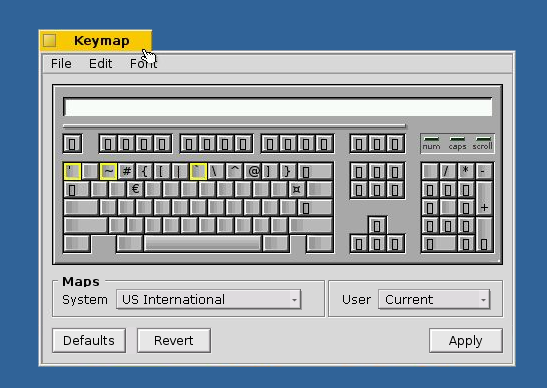
>> Here is a muckup of what i had in mind
>> http://remi.grumeau.free.fr/haiku/keymap_2.png
>
>
> IMHO this looks good. Some suggestions you did not ask for :-)
>
> 1) I would move the "Maps" group on top as it provides informations you
> have to know first in order to interpret the keys on the keyboard.
>
> 2) I would put a colon after popup menu labels ("System:", "User:").
>
> 3) I would remove the group around "User mapping" and put it inside the
> "Maps" group (as it logically belongs to that group). I think some space
> between the System popup menu and User label is sufficient to separate them.
+1 to all three.
Jorge
Other related posts: