[haiku-commits] Re: haiku: hrev48393 - src/preferences/mouse
- From: Adrien Destugues <pulkomandy@xxxxxxxxx>
- To: haiku-commits@xxxxxxxxxxxxx
- Date: Mon, 1 Dec 2014 09:44:27 +0100
On Sun, Nov 30, 2014 at 11:17:46PM -0500, John Scipione wrote:
>
>> On Nov 30, 2014, at 7:55 AM, Axel Dörfler <axeld@xxxxxxxxxxxxxxxx> wrote:
>> Not that the previous mouse was pretty, but this one really looks bad,
>> and doesn't fit into the UI because of its bold lines. The previous one at
>> least didn't try to look realistic.
>>
>> Isn't there someone with an artistic talent that could take care of this?
>
> Can someone post a screenshot comparison for the uninitiated (namely, me) to
> compare the two?
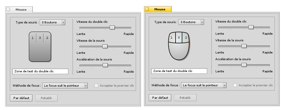
http://pulkomandy.tk/drop/mouseprefs.png (old left, new right)
I used bold lines to match our icon style (at this big size our icons
have similar thick lines). This can easily be changed:
http://pulkomandy.tk/drop/screenshot2.png
(quick test, needs some coordinates tweaking)
--
Adrien.
Other related posts: