[haiku-commits] Re: haiku: hrev47085 - src/kits/interface
- From: Ingo Weinhold <ingo_weinhold@xxxxxx>
- To: haiku-commits@xxxxxxxxxxxxx
- Date: Thu, 03 Apr 2014 22:02:27 +0200
On 03.04.2014 21:37, John Scipione wrote:
Ingo Weinhold wrote:
On 01.04.2014 23:25, jscipione@xxxxxxxxx wrote:
Can you elaborate on what you mean by "too low"? It is obvious that a
"q" or a "y" will not appear vertically centered, since they use only
part of the ascent but possibly the full descent.
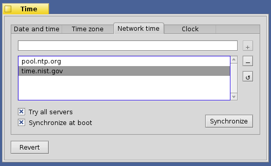
Take a look at this (in-development, not final) screenshot of Time prefs:

http://24.media.tumblr.com/5b3e364ad526b8b35941d9feacd7f415/tumblr_n3d34xBygU1r0f0hfo1_1280.png

See how the +, -, and reset button labels are close to the bottom of the
button? The minus looks like an underscore, that's what I mean by too
low. You could also see the same effect in Keymap on the Tab and Return
keys.
Is a maximum height forced on the buttons in this case? If such a
maximum is smaller than the required space, it would cause ...
+ break;
+ }
+
+ switch (alignment.vertical) {
+ case B_ALIGN_TOP:
+ location.y = rect.top + ceilf(fontHeight.ascent);
+ break;
+
+ case B_ALIGN_MIDDLE:
+ default:
+ location.y = floorf((rect.top + rect.bottom - height)
+ / 2.0f + 0.5f) + ceilf(fontHeight.ascent);
+ break;
... a negative value here. While BLayoutUtils::AlignInFrame() would
return 0.
Some actual numbers would be nice.
+ case B_ALIGN_BOTTOM:
+ location.y = rect.bottom - ceilf(fontHeight.descent);
Since BView::DrawString() draws above the specified baseline (at least
that's how it is documented in the BeBook), this leaves a gap of one
pixel.
So... given the responses here, the best course of action seems to be to
go back to using AlignInFrame() in all cases
Yes.
but adjust the rounding so
that we get a visual pleasing button label placement.
No. The first step would be to understand what goes wrong. Then a
solution can be sought.
I don't really know how to do that other than to play with the code to
see what works.
Print all involved values and understand why what happens. Draw a
diagram, if that helps. In the end some fine tuning might be needed --
e.g. centering the text rect might not look most pleasing, but rather
placing it off center by a fixed or relative distance -- but that should
come after having understood the situation fully.
On a tangentially related note, in BButton::Draw() just before we draw
the label we have the following code:

// always leave some room around the label
rect.InsetBy(kLabelMargin, kLabelMargin);

... where kLabelMargin is 3. This causes problems with some Be apps (and
even some Haiku apps) that have tight margins and thus won't allow the
label to display. Since we always center the label horizontally and
vertically can we remove this code?
The class should rather get methods to manipulate the margins, so that
new code can adjust them, if desired. For old code we might need to
implement some compatibility behavior.
CU, Ingo
Other related posts: