[haiku-commits] Re: haiku: hrev47085 - src/kits/interface
- From: Ingo Weinhold <ingo_weinhold@xxxxxx>
- To: haiku-commits@xxxxxxxxxxxxx
- Date: Sat, 05 Apr 2014 10:27:31 +0200
On 04/05/2014 01:30 AM, John Scipione wrote:
On Fri, Apr 4, 2014 at 6:06 PM, Ingo Weinhold <ingo_weinhold@xxxxxx> wrote:
On 04/04/2014 01:55 AM, John Scipione wrote:
Ingo Weinhold wrote:
On 03.04.2014 22:42, John Scipione wrote:
As a work-around for old/broken code, a boolean parameter could be added to
BLayoutUtils::AlignInFrame() which would force alignment in case of a
constraint violation. E.g.:
[...]
No, that is not very elegant, I don't like that solution at all. You
say that it is a work-around for old/broken code, but, what code is
old/broken exactly?
Code that calls (directly or indirectly (e.g. by forcing a button to be
smaller than its minimum size constraint)) BControlLook::DrawLabel()
with a rect that is smaller than the text size.
I'd rather keep the current code than alter
BLayoutUtils::AlignInFrame() in such a manner.
BLayoutUtils::AlignInFrame() is just a utility method. It already deals
with sizes greater than the available size -- by restricting the result
rectangle to the available size. The new parameter would simply provide
another option for dealing with it.
If you mean by "current code" the code that you added back, then I
disagree. As Stephan already wrote, duplicating the alignment code is
not a nice option (particularly because it is surprisingly error prone,
as I pointed out in my initial reply). Having a central place for such
utility code seems the best solution.
As you can see, the change in BLayoutUtils::AlignInFrame() to support
the alternative "overflow" handling is rather small (just an addition to
the "if" condition). Another possibility would be to add an
AlignOnRect() method, whose name wouldn't suggest that the result is
restricted by the given frame, respectively change AlignInFrame() as
suggested and rename it.
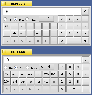
http://24.media.tumblr.com/ae6711c88880d7cbe993b0f86e071288/tumblr_n3h72l1mwW1r0f0hfo1_400.png

Both images are set to 10pt DejaVu Sans font, the buttons in the top
image are set to a 3px margin, the buttons in the bottom image have no
margin. As you can see the margin cuts off the text in some of the
buttons making the app unusable.
Someone decided that a margin -- more correctly: spacing between button
frame and text -- of 3 pixels produces aesthetically pleasing results.
It is the wisdom of this decision that I am calling into question. In
a previous email you stated that including a margin, or, in CSS
parlance, padding in BButton::Draw() increases the button size, so
omitting the padding makes all buttons smaller. I thought about this
some more and this isn't the case.
>
Insetting the drawing area before drawing the label in BButton::Draw()
has no effect on the button size.
Please note the difference in the used phrasing: Adding padding does
make the button larger. Changes in BButton::Draw() regarding where the
label is placed obviously don't have an effect on the button size.
In order to achieve that you need to
alter the MinSize(), MaxSize(), or PreferredSize() methods to include
a margin, or, in the case of BButton that has a frame rectangle
specified (the old way), the ResizeToPreferred() method.
Indeed, and exactly that is done (in BButton::_ValidatePreferredSize()).
I have no problem specifying a padding in those methods, either at a
fixed size like we currently do, or as a settable parameter. However,
if you don't use the layout APIs to layout your buttons, and you don't
call ResizeToPreferred() but instead you specify the button positions
manually as is done in BDH Calc you should be allowed to utilize the
total button area to display the label, and we can only achieve this
if we remove the Inset line from BButton::Draw().
That is the work-around for broken code. And yes, the code is broken
(and already was in BeOS). You cannot expect a control to look OK, if
you force it to be smaller than its minimum size.
If you force the button to a smaller size than it needs, then, obviously,
something will break visually. Currently only the text will be truncated
while the margin stays intact. By centering the text in the rect that
includes the margin, the margin will break and potentially (when small
enough) the text as well.
Forcing a padding in Draw() breaks things visually as you say, but,
there is no gain for this breakage. As I am trying to explain above,
we can have our cake and eat it too.
As I wrote in my previous mail, there is breakage in either case.
Restricting the drawing of the label to the area that was intended for
it will keep the aesthetics intact while it may cause the label to be
truncated. Ignoring the padding may break the aesthetics and it may
additionally truncate the label.
In any event, code forcing the button to be too small is broken.
If old code relies on the latter behavior, it's probably best to use that
behavior. New code simply shouldn't violate the button's size constraints. A
setter for the margins would address special needs.
Having padding on buttons is visually pleasing, but, it doesn't make
sense where it currently is in the Draw() method.
It does make sense to consider the padding in Draw() (as it matches how
the layout of the button is computed) and it would be even necessary
should we ever introduce other label alignment modes than the current
B_ALIGN_CENTER.
Anyway, as I wrote before, I'm not opposed to introducing a work-around
for broken code.
CU, Ingo
Other related posts: