[haiku-bugs] Re: [Haiku] #8747: New "Action Stop" icon for WebPositive with better perspective.
- From: "jstressman" <trac@xxxxxxxxxxxx>
- Date: Thu, 19 Jul 2012 16:05:21 -0000
#8747: New "Action Stop" icon for WebPositive with better perspective.
----------------------------------------+----------------------------
Reporter: jstressman | Owner: leavengood
Type: enhancement | Status: new
Priority: normal | Milestone: R1
Component: Applications/WebPositive | Version: R1/Development
Resolution: | Keywords:
Blocked By: | Blocking:
Has a Patch: 1 | Platform: All
----------------------------------------+----------------------------
Comment (by jstressman):
I beg to differ.
While I didn't get mine quite right by just eyeballing it in Icon-O-Matic,
I most certainly got it a heck of a lot closer to correct than the
original.
I'm also very familiar with the icon guidelines, having read them over
many times now... like when I worked on the USB Floppy icon previously.
(See #6677, which you saw in the past.)
You can have your issues with 3d toolbar icons if you want, but please
don't incorrectly imply that I'm that ignorant and incompetent. Thanks.
I'm attaching two images to illustrate my point quite clearly. While the
arrows are pretty close to spot on, the Home icon is really not much
better than mine and actually pretty closely matches the perspective I
used, in part because I was looking to match the X to those specific icons
in particular... so I was following that perspective and not the reference
box in the guidelines, which I don't have a nice reference of to use as
guidelines in Icon-O-Matic.
That said, I'll go ahead and redo the icon again to get it even closer to
the guidelines. It's just difficult because I'm not only still new to the
tools, but the tools themselves are a bit lacking compared to what I'm
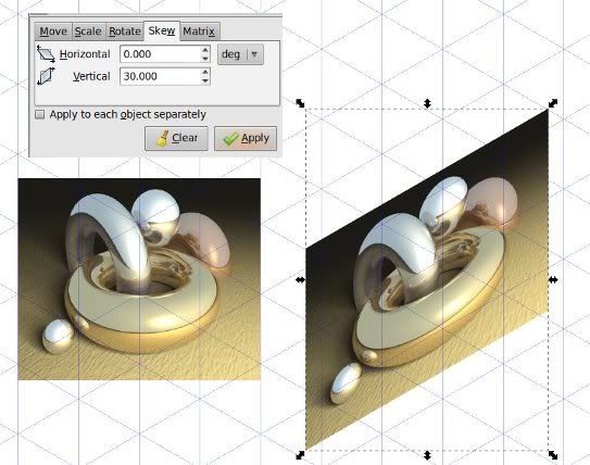
used to. An apparent lack of "skew" is one that I've run into a few times
so far. Something like this:
http://i32.photobucket.com/albums/d12/phreadom/skewed_bitmap.jpg But I
digress...
--
Ticket URL: <http://dev.haiku-os.org/ticket/8747#comment:6>
Haiku <http://dev.haiku-os.org>
Haiku - the operating system.
Other related posts: