[haiku-development] Re: Keymaps application UI
- From: "Stephan Assmus" <superstippi@xxxxxx>
- To: haiku-development@xxxxxxxxxxxxx
- Date: Sun, 24 Aug 2008 01:18:36 +0200
-------- Original-Nachricht --------
> Datum: Sat, 23 Aug 2008 17:13:35 +0200
> Von: "Remi Grumeau" <remi.grumeau@xxxxxxxxx>
> An: haiku-development@xxxxxxxxxxxxx
> Betreff: [haiku-development] Re: Keymaps application UI
> >> On the other hand, two dropdown menus down under the virtual keyboard
> would
> >> do the job also, and take less spaces.
> >> Impression ?
> >
> > I think that is a good idea and I will look into it.
>
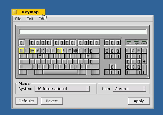
> Here is a muckup of what i had in mind
> http://remi.grumeau.free.fr/haiku/keymap_2.png
A list view in general isn't so bad. It just needs to be bigger. Navigating a
popup menu with that many entries is certainly less fun. Also the listview
should support jumping to keymaps by an "incremental typing the name" feature.
I don't know what the purpose of the second listview is. Wouldn't it be much
better to have a single list view that also lists user saved custom keymaps at
the end of the list, behind a separator line perhaps? Then the list view would
be more than twice the height.
Best regards,
-Stephan
Other related posts: